
Texture in Photography: How to Capture Depth, Detail and Feel
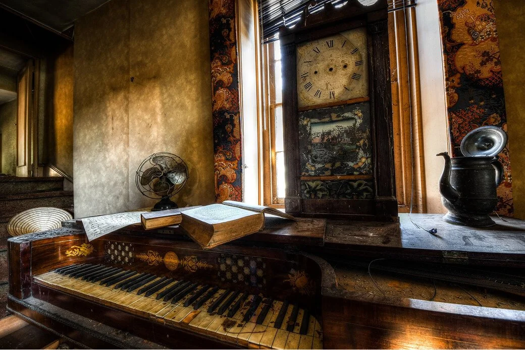
I ran my palm across a wall I had just photographed and felt every ridge my fingers passed over. Then I looked at the back of the camera and found almost none of it. The wall in the photo was smooth where my hand knew it was not.
That gap between a surface and a picture of a surface is the whole problem texture photography is trying to solve. Texture is made of shadow, not sharpness. Everything in this guide follows from that one fact.
This is a technique guide on how to photograph texture: how light creates it, what settings hold it, and how to edit a surface without flattening the thing you went there to capture.
Table of Contents
1. What Texture Actually Is
2. Light Is the Whole Game
3. Settings That Hold the Detail
4. Finding Texture Worth Photographing
5. Texture as a Supporting Element
6. Color, Black and White, and Texture
7. Editing Without Wrecking It
8. A Note on Texture Overlays
9. Final Thoughts
10. Texture Photography FAQs
What Texture Actually Is
Texture is the quality that makes a viewer feel a surface they cannot actually touch. It works by suggestion: the eye reads variation in light and dark across a surface, and the brain fills in the sensation of touch on its own.
This is why a photograph of texture in photography succeeds or fails almost entirely on lighting rather than resolution. A frame can be sharp everywhere and still read as flat if there is no shadow variation for the eye to interpret. A slightly soft shot with strong raking shadows will read as more tactile every time.
Texture, Pattern and Detail Are Not the Same Thing
Pattern is repetition. It is about rhythm, the way tiles or bricks repeat across a wall in a predictable interval. Detail is resolution. It is about how much information the file actually holds, independent of light. Texture is tactile suggestion, and it is about shadow.
A brick wall can be all three at once: a repeating pattern of bricks, a photo with enough detail to show mortar lines, and a surface with enough raking shadow to feel rough. Which one you are actually photographing changes how you frame it. For a wall where the interest is rhythm rather than touch, repetition and balance work differently, and the symmetry post covers that side of the same subject.
Light Is the Whole Game
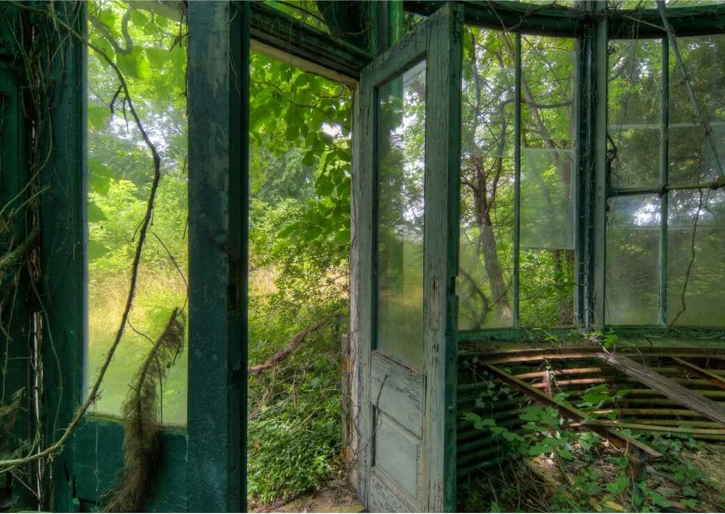
What kind of light brings out texture best in a photograph? Light that arrives nearly parallel to the surface, not light that is soft or hard or a particular color. Every surface is a landscape of tiny ridges and pits, and light arriving at a shallow angle casts a long shadow behind each one. Those shadows are what the eye reads as texture. Light arriving head-on drops straight into the pits and fills the shadows in, and the surface flattens out no matter how bright or how flattering the light source otherwise looks.
Why the Angle Matters More Than the Source
Soft or hard light matters far less than most guides suggest. A soft light at a shallow angle still throws a shadow across every ridge. A hard light straight on fills every pit regardless of how crisp the shadow edges are. Angle is the variable that decides whether texture shows up at all.
Raking Light, Borrowed From Conservators
The formal name for this is raking light, and raking light photography did not originate as a photographic technique. Conservators use exactly this to find cracks in a painting, placing a light source at a narrow angle to the surface of a canvas to reveal every irregularity invisible under normal gallery lighting. Photographers do the same thing by instinct, but it helps to know it has a name and a use outside of art.
There is no single correct angle to aim for. Get as close to parallel with the surface as the light source allows and adjust from there based on how much shadow the surface actually needs.
You Cannot Move the Sun, So Move Yourself
Outdoors, you do not control the light. You control which surface you point the camera at. Walk the building rather than staying in one spot, and find the wall the sun happens to be grazing at that hour. The same wall that looks flat and uninteresting at noon can turn completely alive by late afternoon, once the sun has dropped low enough to rake across it instead of falling straight down onto it. Low sun is raking light at architectural scale, the same mechanism at a much larger size.
What Kills Texture
If your texture shots keep coming out flat, it is almost always one of these three things. On-camera flash, since the light comes from exactly where the lens is and fills every shadow it might otherwise have cast. Overhead midday sun hitting a horizontal surface straight down. Flat overcast on a matte surface that has no color variation to fall back on once the shadow is gone.
Settings That Hold the Detail
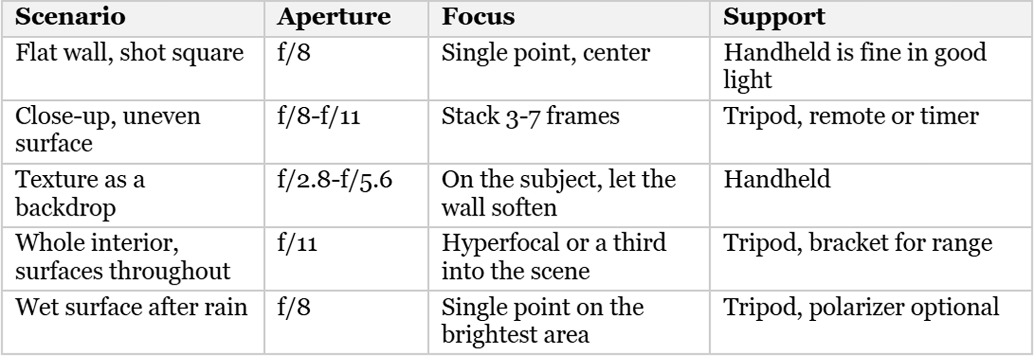
What camera settings should I use to capture fine texture and surface detail sharply? Start with the sensor plane, not the aperture. How to capture texture sharply comes down to four things: shoot with the sensor parallel to the surface, use f/8 to f/11, keep ISO as low as the light allows, and stack focus only when the surface itself is uneven rather than flat. Getting the alignment right does more for sharp texture than any aperture number on its own.
Shoot Parallel to the Surface
This is the strongest tip and the one nearly every guide skips. If the sensor plane is not parallel to the surface, depth of field falls away unevenly across the frame, and one side of the picture goes soft no matter how far you stop down to compensate. Square up to the wall before anything else. Most disappointing texture shots are an alignment problem wearing a focus problem's clothes.
Aperture, and the f/22 Mistake
f/8 to f/11 holds most surfaces sharp once you are shooting square to them. Stopping down further to f/16 or f/22 to try to get everything sharp starts costing the fine detail you came for, because there is a physical limit to how far you can stop down before diffraction softens the whole frame. Shooting parallel to the surface is what lets you use a moderate aperture in the first place instead of reaching for f/22 out of habit.
Focus, and When to Stack
A flat surface shot square needs a single focus point at f/8 and nothing more. An uneven surface up close, flaking paint standing proud of the wall, a corroded valve with real depth to it, brings depth of field down thin enough at macro distances that stacking earns its keep. Most texture work does not need it. Reach for it only when the surface itself has real relief.
Keep ISO Down
Noise looks like texture, so it competes with it rather than helping it. High ISO does not add grit to a surface. It adds a second, unrelated texture sitting on top of the one you were trying to photograph. A tripod and a slower shutter beats ISO 6400 every time here, since texture subjects do not move.
A Starting Point
Use this as a starting point rather than a fixed prescription. The surface in front of you will tell you what needs to change.
Finding Texture Worth Photographing
If you are short on texture photography ideas, the answer is rarely a new location. It is usually the same location at a different hour, or a closer look at a material you already walked past.
Materials That Reward the Camera
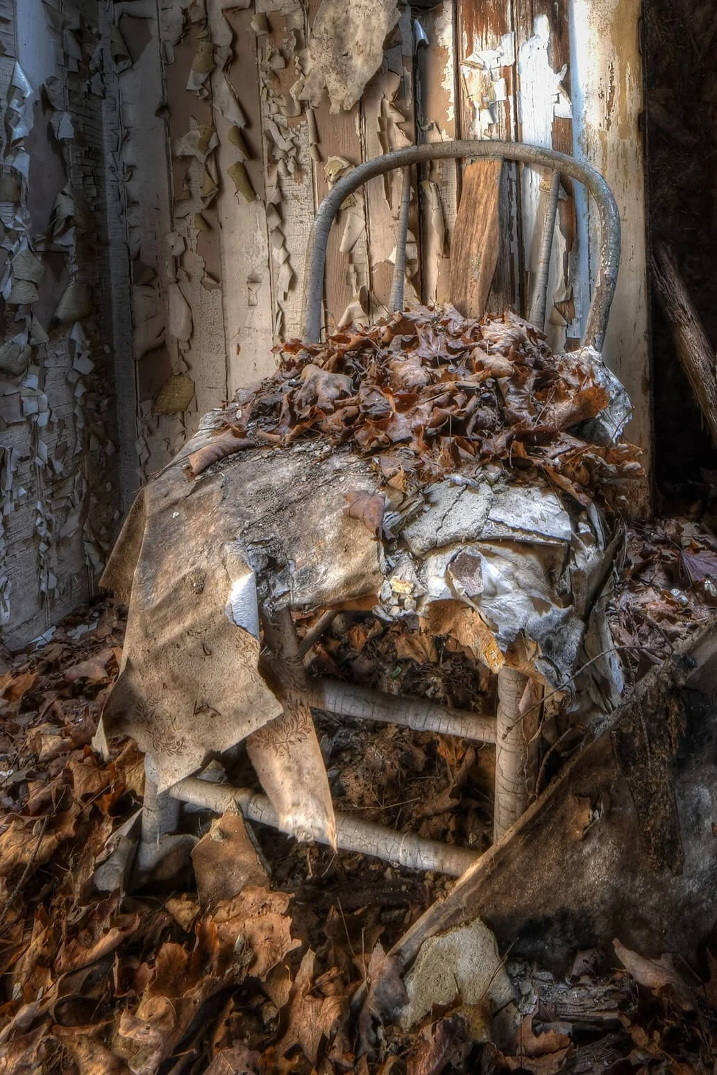
Rust and oxidized metal hold texture especially well because oxidation builds up unevenly, creating real relief for raking light to catch. Peeling paint works best while it is still lifting rather than long gone, since the curl of a paint chip throws its own shadow. Crumbling plaster over lath develops a rough, granular surface as it breaks down, and raking light picks out every crack in it. Weathered wood is worth watching for the soft grain eroding away first, leaving the hard grain standing slightly proud and ready to catch a shadow. Efflorescence, the white mineral bloom that forms on old brick, adds a fine crystalline texture on top of the brick's own surface.
Two Materials Meeting
A single texture is a study. Two textures meeting is a photograph. Rust against smooth glass, moss creeping onto poured concrete, fabric rotting over a metal frame: the contrast between two different surfaces gives the eye a reason to move across the frame and gives the composition an actual subject rather than just a sample. Decaying surfaces in particular offer this kind of contrast constantly, and the urban decay post covers what to do with that material once you have it.
Wet Changes Everything
Rain saturates color and darkens a surface, and different materials respond very differently to that. Rust and weathered wood gain tonal separation when wet and seem to glow. Concrete and pale plaster do the opposite, flattening to an even gray that loses most of its texture. Learning which surfaces improve after rain turns a bad weather day into a planned return trip rather than a wasted one.
Texture as a Supporting Element
Most guides only cover texture as a close-up subject, which leaves out the more useful half of the technique.
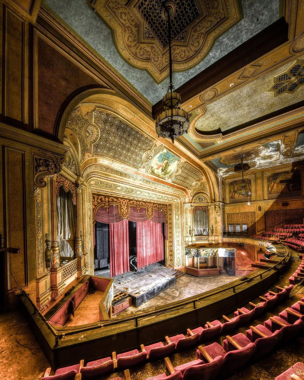
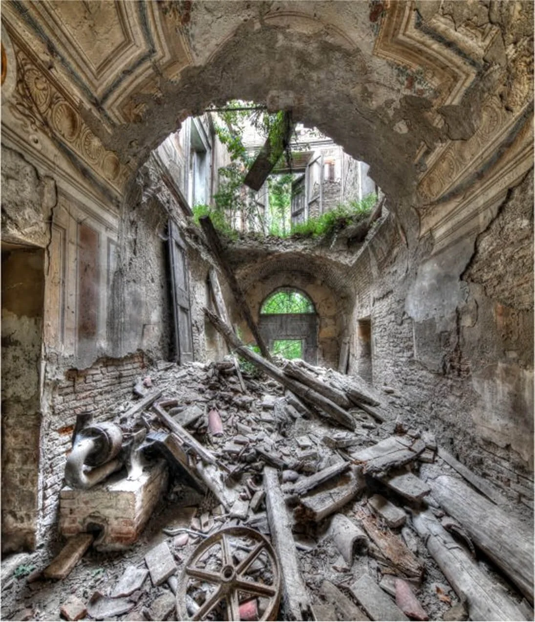
A textured wall behind a subject does the job a studio backdrop does, for free, and with more character than a seamless paper roll ever provides. Foreground texture gives a wide shot somewhere to start and a sense of depth a clean, empty foreground cannot. A whole room where every surface has degraded together carries mood on its own, and the composition becomes about where the eye is allowed to rest rather than what single thing it lands on.
Texture everywhere is visual noise. If every surface in the frame is competing for attention, none of them register. Something in the composition has to stay quiet so the texture elsewhere has room to read. That quiet element does not need to be empty space. A smooth pane of glass, a plain sky, a stretch of still water all work the same way, giving the eye a place to rest before it goes looking for detail again. The contrast is what makes the texture read as texture in the first place.
Color, Black and White, and Texture
Take the color out of a frame and the eye has nothing left to read but tonal variation, which is exactly what texture is made of. That is why so much texture work ends up monochrome. Removing color removes the one thing that might otherwise distract from shadow and shape, and it forces the surface itself to carry the entire image rather than sharing the weight with hue.
The counter-argument keeps this honest: sometimes the color is the texture. Rust running from orange to deep brown across a single surface, oxidized copper going green in patches, paint layers showing three different decades of color underneath each other. Converting those to black and white by reflex throws away the actual subject. Color does a lot of work in these places, and it is worth checking whether color is carrying the image before deciding to strip it. A quick way to check: look at the file in color first and ask what would actually be lost in translation. If the answer is more than shadow and shape, leave it alone.
Editing Without Wrecking It
The Clarity Trap
The common advice is to push clarity and contrast. Past a moderate setting, those tools draw a bright line along one side of every edge and a dark line along the other. The result reads as processing rather than surface. A viewer cannot always say why an image looks wrong, but they can tell. The slider is doing exactly what it is built to do, exaggerating local contrast, and that is precisely the problem. Texture does not need an artificial edge. It needs the shadow that was already there to be visible.
Shadow Separation Beats Sharpening
The lever that actually works is tonal separation. Texture lives in the micro-shadows, so the useful tool is the one that separates the darker midtones from the shadows, a gentle curve adjustment or a shift in the black point. Get the tonal range right first and the surface comes forward on its own, before a sharpening slider gets touched at all. This is a slower way to work than reaching straight for clarity, but it respects what the light already did on location instead of trying to manufacture the effect afterward.
Sharpen Last, and Only Where It Matters
Apply masked sharpening to the surface itself rather than globally across the frame. Sharpening the whole image also sharpens the noise sitting in the shadows, which is the one area you want left alone. A mask keeps the effect confined to the texture that earns it, rather than dragging every flat, quiet part of the frame along with it.
Knowing When You Have Gone Too Far
Run a concrete test. View the file at 100 percent and look along a high-contrast edge. If there is a pale outline tracing it, back off. A second test: does the surface still look like something you could touch, or does it look etched? If either test fails, the edit has moved past the point where it was helping.
A Note on Texture Overlays
The phrase texture photography also gets used for a completely different task: layering texture files, grunge overlays, scanned paper, film grain, over an image in editing software. That is a legitimate technique in composite work and fine art printing, where the goal is building an image rather than documenting a surface, but it is a different job for a different reader than the one this guide is written for. This post is about photographing texture that already exists on a real surface with a camera, not about adding it afterward in post.
Final Thoughts
Texture is the closest photography gets to a sense it cannot actually use. A photograph has no way to let anyone touch the surface it shows, so it has to convince the eye to do the work the hand would normally do. Getting that right is mostly a matter of standing in the right place at the right hour rather than owning the right lens.
I still run my palm across walls before I photograph them. Not because it changes anything technical about the shot, but because it tells me what I am trying to get the camera to say. If my hand finds something my eye missed, that is usually where the photograph actually is.
Texture Photography FAQs
What is texture in photography?
Texture is the visual quality that makes a viewer feel a surface without touching it. It comes from variation in light and shadow across a surface rather than from sharpness or resolution, which is why a soft file with strong directional shadow often reads as more tactile than a technically sharper one shot in flat light.
What kind of light is best for photographing texture?
Light arriving at a shallow angle to the surface, close to parallel rather than head-on. This is called raking light, and it throws a long shadow behind every small ridge and pit. The exact source, soft or hard, natural or artificial, matters far less than getting that angle right.
What camera settings should I use for texture photography?
Shoot with the sensor parallel to the surface first, since misalignment softens one side of the frame regardless of aperture. Use f/8 to f/11 for most surfaces, keep ISO low and use a tripod instead of pushing sensitivity, and stack focus only on uneven surfaces with real physical relief.
What is the difference between texture and pattern in photography?
Pattern is repetition, the rhythm of a repeating shape like tiles or bricks across a surface. Texture is tactile suggestion created by shadow. A single surface can show both at once, but which one is actually driving the photograph changes how you should frame and light it.
Do I need a macro lens to photograph texture?
No. Most texture work happens at normal shooting distances with a standard lens, since the technique depends on light angle rather than magnification. A macro lens becomes useful only when you want to isolate very fine surface detail up close, and even then a tripod and correct alignment matter more than the lens itself.
Should texture photos be in black and white?
Often, but not automatically. Removing color leaves only tonal variation for the eye to read, which suits texture well. But when the color itself is doing real work, rust shifting from orange to brown, or paint showing several old layers, converting to black and white throws away the actual subject rather than simplifying it.